It’s a good idea to periodically review your website. And it’s not just about content, but all your website elements.
I was skimming some webinar materials the other day on websites and what works and what doesn’t. Some of the advice was pretty basic, like making sure your paragraphs are more Hemingway than Faulkner (i.e., on the shorter side) and that your page titles and headlines guide your audience wisely. And probably keep your sentences short too. See what I don’t always do?
As always, your mileage will vary. And although there are guidelines and best practices, what works for me might not work best for your business.
That said, Web design is constantly evolving. What made sense in the era of corporate brochures is obsolete in an age where content management systems make it easy to update information. Meanwhile that sparkly plugin that looked cool when there weren’t a lot of plugins available might just be clutter today.
Six website elements worth revisiting.
1. Dates on blog posts. The problem with dates in URL (and especially for blog posts) is that it’s harder to position old content as evergreen. See a date that’s a year, two, or older, and your first instinct is that it’s “old” information. During my last redesign I asked about removing the dates (it’s easy enough to do in WordPress). The challenge: then your URLs are different (doh) — which means any inbound links are now pointing to pages that don’t exist. So I’ve kept the dates. But if I were starting a blog today, I’d probably do it differently.
2. Location of your social buttons. My Twitter, LinkedIn, and Google+ share buttons are at the top of each page. Does this positioning still make sense? Good question. The webinar presenter’s comments about location had to do with the content of your tweets, Facebook posts, and so forth. If it’s not brand relevant, then maybe you don’t want the links top of page. This is actually the reason I generally recommend people not embed their latest tweets on their sites.
At one time having social channels was a form of social proof. In my next redesign, I will probably put my social buttons at the bottom of the page. And, yes, the G+ button probably needs to go away.
3. Embedding video. I was looking at a short video recently on a serious topic, and when it ended I was given recommendations for a whole bunch of late-night clips. The dichotomy was startling, and I wondered how to stop that from happening. Turns out there’s an easy fix.
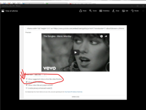
Just hit “more” when you’re getting ready to grab the embed code for a YouTube video and unclick the “show suggested videos when the video finishes” option.
4. Photos. Political campaign sites are notorious for using boring, yes-everyone-else-is-using-this-picture-too stock photos. Even if you’re managing a political campaign site, don’t do this. The quality of every visual matters more and more, so make sure your site is filled with as many authentic images as possible. When you do need to find a stock photo, look to un-stock sites first.
5. Testimonials. The Webinar presenter does not like standalone testimonials pages. I do. But — yes, there’s a but — he has a point about the value of not hiding your testimonials. His advice is to embed testimonials on different pages. I’ve seen this work on some sites. On many sites, however, it feels forced and inauthentic as people cherry-pick a line or two that “fits” the page you’re on. While I have a standalone testimonials page, I also embed a few relevant testimonials on my speaking page.
6. Contact forms. Yes, this topic again. And, once again, the argument for contact forms is spam. Just three words: spam filters, people! I’m bringing it up again because I believe contact forms are a bad idea — especially for small businesses where a point of competitive differentiation is your reachability. I don’t want prospects bouncing off my site because there’s a wall between us. Do you?
Feature photo by aubergene (Flickr).