Content strategy is easy. You're probably reading this and thinking I'm crazy. But, really, creating a strategy for building content is the simple part. No, it's not really "easy," but deciding you need a blog (or a video series, a podcast, a Twitter feed, or some...
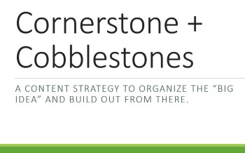
How to Use a Cornerstone and Cobblestones Approach to Content
read more